it was time for a new logo
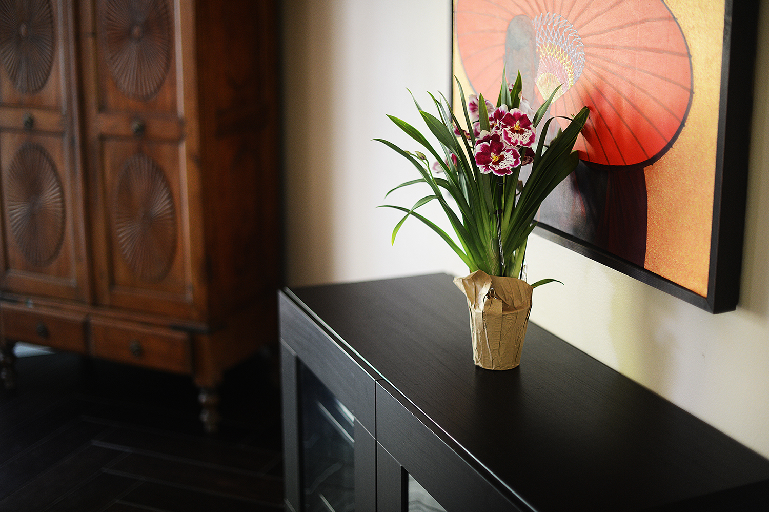
So, a week or so ago, I bought some orchids and shared a photograph of them on my Instagram page. In the caption, I wrote the following:
Over the years, different flowers have been my favourites. When I was a kid, I loved tulips - I loved their simplicity, and the way their stems go all crazy when they've been in a vase for a few days. Then, beginning in my 30s, I decided I preferred callas - they're like the elegant older sisters of tulips. I held a bouquet of callas when I got married.
These days, however, I'm more drawn to orchids. I love their variety of shapes and sizes and colours. I love how they remind me of my tropical home (my grandmother had dozens of them growing in her back garden). And I love how they're paradoxically both elegant and wild - attributes I'm learning to appreciate and hope to embody more and more as I get older.
So I think my new official favourite flower is the orchid. They symbolize (for me) what it means to #thriveoutloud.
After I shared that post, I suddenly realized that it was probably time for me to update my logo. I'd been using an image of a grey monstera leaf for several years, and while I loved its tropical feel, there really wasn't much of a reason behind why I'd chosen that image (in fact, if I'm honest, a designer of a previous iteration of Chookooloonks chose it for me). It seemed that if I felt as strongly about orchids as I apparently did when I wrote that Instagram post, then perhaps I should make it a part of my logo. And so, I decided to look for one that I enjoyed.
And I found one. It was glorious. It was this lovely illustration of an orchid, somewhat abstract, in a beautiful blue colour -- and blues in jewel tones have always been sort of trademark colours for me, because they remind me of home, and the Caribbean Sea. The picture I found was on a stock image site, so I paid for it and downloaded it, and designed a logo around it that I liked. And then (because you can take the girl out of law, but you apparently can't take the law out of the girl), on a whim I decided to read the license agreement that came with the image.
It turns out that while I could've used the image for just about everything I could imagine -- to illustrate my site, as part of wedding invitations, to create a meme -- one of the few absolute prohibitions was that I wasn't allowed to use it in the creation of a logo. (Fun fact: it seems this prohibition is pretty standard on most stock image sites -- so be sure to read the license when you download!) I admit that there was a part of me that wanted to pretend I hadn't seen it, but dammit, I'm a lawyer. That excuse wouldn't take me very far.
But I loved the idea of a hand-drawn orchid. So I thought for a moment, and then I remembered that I know a really talented artist.
My husband, Marcus.
So I called him at work, and said what I always say when I want him to do something for me, especially if it's something that he might consider a chore:
"Marcus, honey? I've got something fun for you to do!"
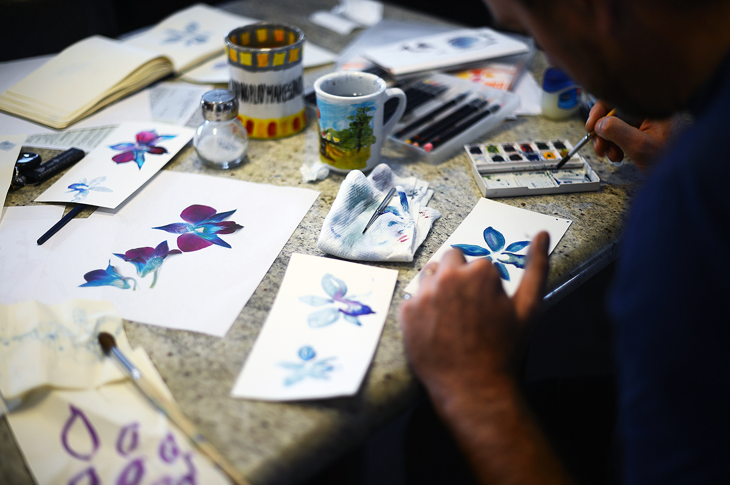
He sighed, like he always does (because I really do say that every time there's a chore to be done), but then this morning, he picked up his water colours and a sketchpad and a couple of photographs of orchids printed from the computer, and got to work. He spent HOURS on it -- honestly, I started feeling bad, because I didn't expect it to take him very long. The kitchen was strewn with trials and errors (all of which I've saved, of course).
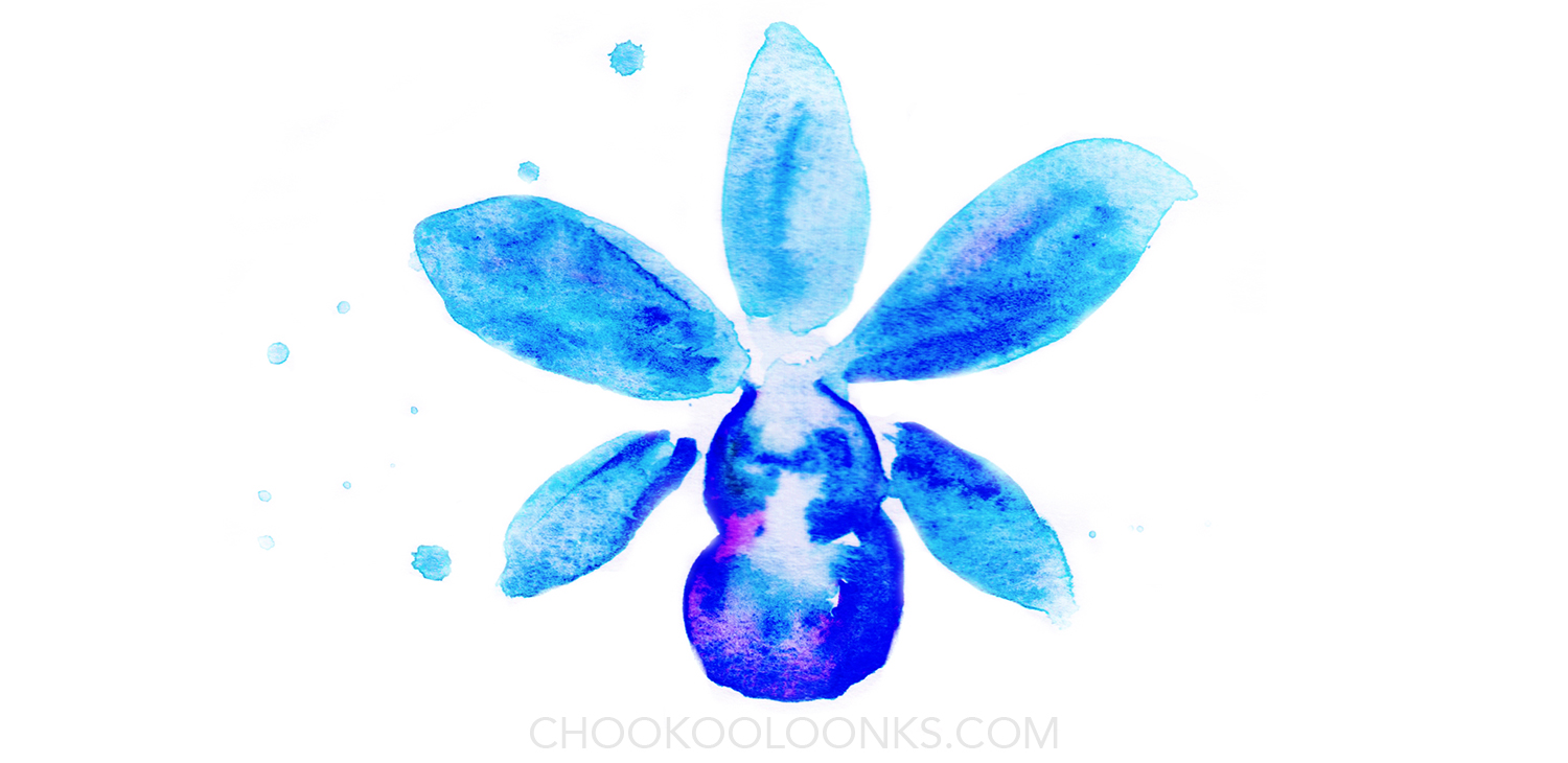
He took the work very seriously, and after a tiny bit of input from me (ahem!), he came up with a design that I love:
Isn't it great? I scanned it, and played with the colours a bit, and it's perfect -- even better than the one I purchased and downloaded. I love it so much.
And so -- welcome to a newly-branded Chookooloonks. Here's to wild elegance, and thriving always.
Have a great weekend, friends.


